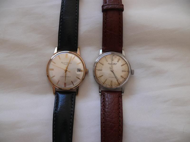
I have a number of watches from different makers made in the late 50s and early 60s.. One thing I have noticed is the names on the dials and the fonts used compared to their modern equivalents.. Watches from earlier years seem to me to have a nicer style of font than those on the more modern watches..
I find that the International Watch Co on my vintage IWC to look much nicer than the newer models with their 'chunky' IWC badge..
So what do you think?

 ](
](