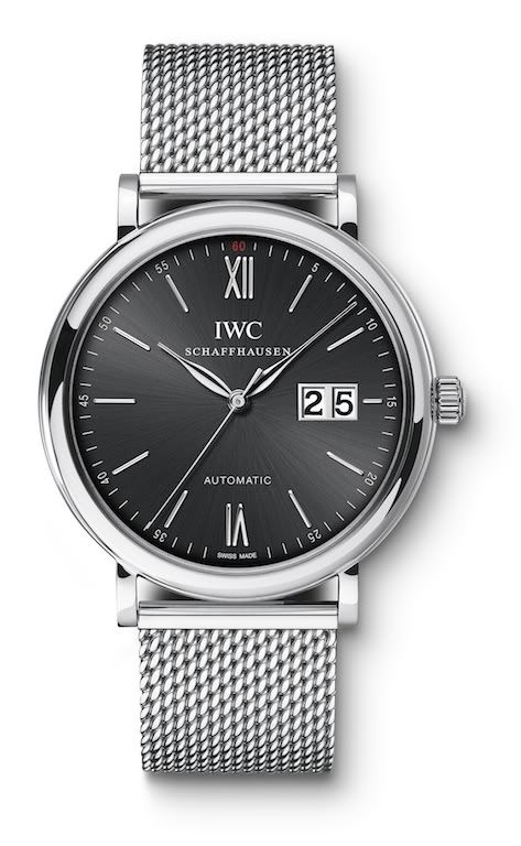
Lutz, I don't mean to be the lone dissenter, but with respect I'm glad IWC doesn't make such a watch.
To me, the value of the Portofino design is its grace, its lines, its subtlety. I think it does actually embody the special sophistication and charm of the Italian Rivera, marketing or not. There is a 1950-60s classicism to the design.
The large double-date window destroys all that to me. It looks very Teutonic --in fact, something Lange introduced in the 1990s (I know, I know about the Dresden Opera House, but we're talking watches). I like Langes, but not a hybrid design that juxtaposes discordant elements. I'd buy a Lange for what it is, but I'd also buy a Portofino for what it is.
A large double-date, frankly, pollutes every design principle reflected in the Portofino: it takes away the subtlety, the classicism and the understatement. The Portofinfo is all about graceful round/curve shapes with thin lines, and add a domineering square or rectangle to it confuses the principles.
I think it's altogether too easy to take any watch with a small date and Photoshop a large one on it. To me watch design involves more issues.


