• Insider
    10 Feb 2012, 6:26 p.m.

    Sorry, couldnt show you the Portofino Automatic big date I wanted to show you. Uploading on photobucket it always moved the date towards the mark at 3 oclock. And that does not look very good. So I better let it be.
    Sorry once more :-((.

    Regards, Lutz

  • Master
    10 Feb 2012, 7:04 p.m.

    Picture Uploading - A Snappy Guide
    To upload a pic to the forum, you will need to first upload the picture onto a hosting site. This can be space provided by your internet service provider (your account may already come with one with a limited size). Whatever the case, the pic has to reside on a permanently live server and cannot be on your harddrive.

    Quick Step One: most people sign up for a free host at www.photobucket.com
    Quick Step Two: Upload your pic, preferably in 640x480 size
    Quick Step Three: Look for this box below and click on the URL beside IMG Code, and paste it directly in ‘Your Comment’ box when writing a new comment in the forum.
    i1120.photobucket.com/albums/l497/vanhalen812/Admin%20Stuff/photobucketimagecodeslinks.jpg
    Quick Step Four: check, check, check that you have successfully uploaded the pic (like I have done with the image directly above :) by using the preview button

  • Insider
    10 Feb 2012, 7:24 p.m.

    Thank you very much, but this is not my problem.
    I can upload to photobucket and I can load it down to the forum.

    But uploading on photobucket the little space between the big date and the mark at 3 oclock which I have on my picture on my computer disappears and the date touches the mark and that does not look very good. I dont know why but I can`t help.

    Regards, Lutz

  • Master
    10 Feb 2012, 7:36 p.m.

    Dare I suggest take another set of photos at a different time!

  • Insider
    10 Feb 2012, 8:09 p.m.

    Hey, great, yeah, this is the one and only Portofino Automatic Big Date.
    Thank you so much Vinhthang - you did it what I could not perform!

    And now dear members you can give your professional opinion - just if you like
    :-)).

    Regards, Lutz

  • Master
    11 Feb 2012, 12:25 a.m.

    Wow. I did not know about this model. They are going to sell a lot of these!!

  • Master
    11 Feb 2012, 1:50 a.m.

    well lutz, i think if you ask dozens of different forum members you'll certainly get different groups of answers as it's obviously a personal preference. if you are debating on buying the watch i think the answer is simple - just try it on and see if it speaks to you, then look in the mirror and see if it can speak for you. and if you need to get a second opinion, i'd only go for someone closest to you (like a loved one) who can comment on whether the watch 'is you'.

    for me, it's not quite my cup of tea - not sure about the inconsistency in only having the 6 and 12 in roman numerals. it would look so odd or say 'victorian' on me (but don't get me wrong i work for a company that actually owns and refurbishes grand victorian buildings!). i am just more a fan of a more contemporary style but with hints of tradition... for example a massive fan of my new ardoise da vinci. (but then i'm sure there are many here who can't stand this shape or style!)

    good luck,
    vinhthang

  • Master
    11 Feb 2012, 5:10 a.m.

    interesting pic vinhthang -- is this a ref 3565 ? the date complication is different from a ref 3565 though.

    i1120.photobucket.com/albums/l497/vanhalen812/Portofino/Portofino.jpg

  • Master
    11 Feb 2012, 11:33 a.m.

    shing - i personally prefer that date complication in your picture - much more subtle and suiting to the watch (especially with black background to compliment the dial). best, vinhthang

  • Master
    11 Feb 2012, 12:28 p.m.

    At last, the date of the Da Vinci Automatic in another watch. I think it is a great idea, and it looks quite nice, it spices this model a bit if you think the regular model is too subdued.

    Kind regards,
    Paul

  • Apprentice
    11 Feb 2012, 3:56 p.m.

    Is that a real model or photoshop?

    Best,

    Robert

  • Insider
    11 Feb 2012, 5:54 p.m.

    Vinhthang
    You are absolutely right - it is a question of taste and each has to decide for himself.
    The small date looks more decent indeed. And a black background with white numbers would suit more the dial - and may be another type of numbers would be fine too.
    I don`t think the regular model is too subdued - not at all - but I believe the big date gives quite a different touch - from decent towards bold conception, spacious - it opens the view to the dial and the date becomes more important. It changes from a decent footnote to an important information on first sight.

    Regards, Lutz

  • Insider
    12 Feb 2012, 11:20 a.m.

    Photoshop! IWC would never take the date of the Da Vinci Automatic (Paul/Sunflower found that) and place it in a Portofino. If IWC would choose a bigger date for the Portofino Automatic (would be very interesting indeed) they would create it new or take the date from the Portofino Handwinding. The date there suits perfect and looks absolutely great.

    Welcome to the forum Robert :-).

    Regards, Lutz

  • Master
    12 Feb 2012, 11:50 a.m.

    Assuming the sizes of the 30130 (Da Vinci) and the 35110 (Portofino) movements are about the same, sizewise the big date could be added to the Portofino. The date of the Portofino 8 days handwound could probably not be mounted because of size. Photoshop or not, I still like the idea.

    Kind regards,
    Paul

  • Insider
    12 Feb 2012, 10:44 p.m.

    Thanks Paul - so good we got you our "masters" with much experience and skill!
    I didn`t know what you told us about the sizes of DV and PA - that is very interesting indeed.
    But I wonder how it would look like if the background of the date had the colour of the dial, the numbers where white and where not DV-like but PA-like. May be it would look fantastic - too bad we never will know.

    Kinde regards, Lutz

  • Connoisseur
    12 Feb 2012, 11:04 p.m.

    Lutz, I don't mean to be the lone dissenter, but with respect I'm glad IWC doesn't make such a watch.

    To me, the value of the Portofino design is its grace, its lines, its subtlety. I think it does actually embody the special sophistication and charm of the Italian Rivera, marketing or not. There is a 1950-60s classicism to the design.

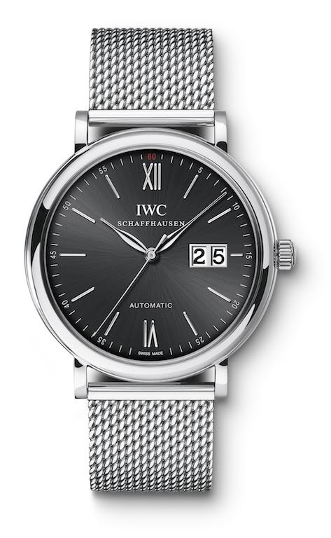
    The large double-date window destroys all that to me. It looks very Teutonic --in fact, something Lange introduced in the 1990s (I know, I know about the Dresden Opera House, but we're talking watches). I like Langes, but not a hybrid design that juxtaposes discordant elements. I'd buy a Lange for what it is, but I'd also buy a Portofino for what it is.

    A large double-date, frankly, pollutes every design principle reflected in the Portofino: it takes away the subtlety, the classicism and the understatement. The Portofinfo is all about graceful round/curve shapes with thin lines, and add a domineering square or rectangle to it confuses the principles.

    I think it's altogether too easy to take any watch with a small date and Photoshop a large one on it. To me watch design involves more issues.

  • Insider
    13 Feb 2012, 12:13 a.m.

    Michael, you are probably absolutely right - concerning watches and Haute Horologerie I dont know the first things about. As an absolute layman I just like - or dont like a watch.
    And I`ve got to admit the existing Portofino Automatic designed by high professionals is perfect and I love it.
    I just beg for mercy for the - in my opinion - also very Italian Da Vincy Automatic with exatly this teutonic big date :-).

    Regards,Lutz

  • Connoisseur
    13 Feb 2012, 1:14 a.m.

    Hi Lutz.

    Well, if you speak romanisch the watch could be perfect ;)

    Actually all taste is subjective and I have no basis for my opinions to be right. I hope you appreciate I wasn't being personally critical at all --this one watch is just not my style.