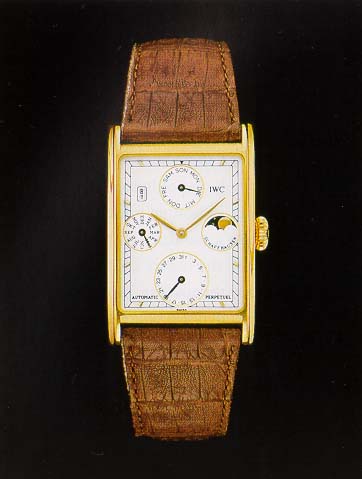
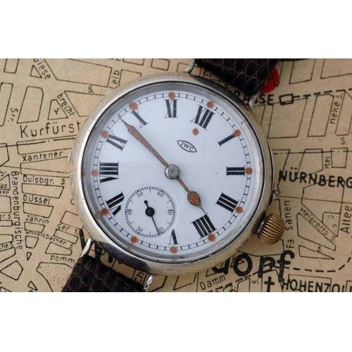
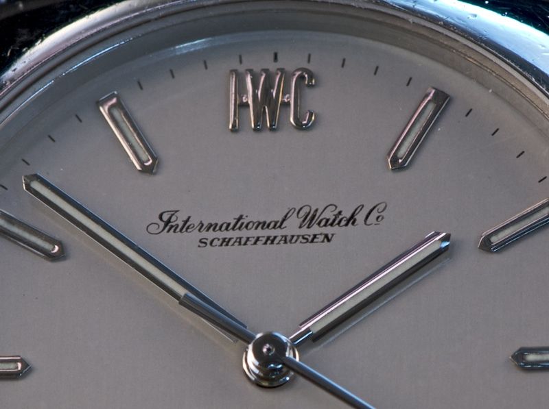
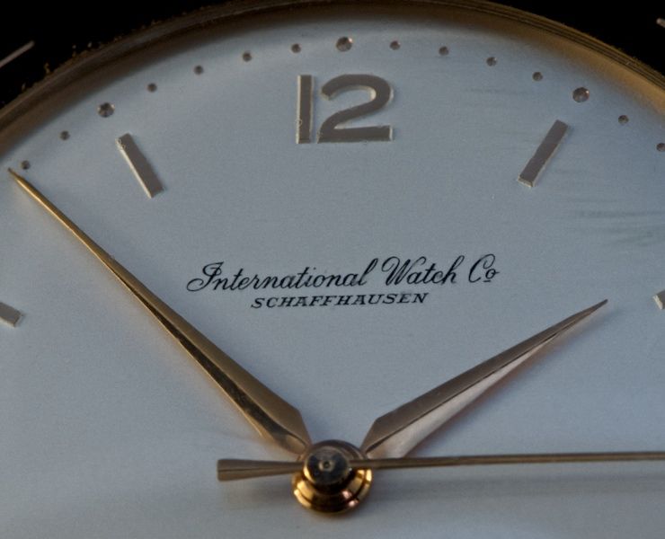
There are many archived posts showing the varying IWC Schaffhausen logos utilized overtime. The obvious major variation in my small collection is the logo evolving from a script International Watch Co. to the block IWC Schaffhausen we see today. There are also variations in the placement of the logos based on the specific design of the dial. It takes an extensive archive search to locate the many different major and minor design changes. It would be great to have one thread with as many of the IWC logo designs in one place as possible so please post your variations for future reference.
Here is a start from my small IWC collection. Below the photo is a list of the reference numbers and approximate date of introduction / production for these models (please correct my date information. I used the only info I had in my small reference library and it is not complete or necessarily correct.)
[ ](i95.photobucket.com/albums/l156/wbarker75/LogoProjectforForum.jpg)
The two script logos in the first column is a reference # 1829 IWC Golf Club from ~1977. The second is the oldest in my collection the IWC reference 804 cal 89 from the 1960’s. The script is identical as far as I can see, but unlike the cal 89, the Golf Club combined both an applied IWC block logo with the script. I would love to see some of the older versions / variations of the script logo.
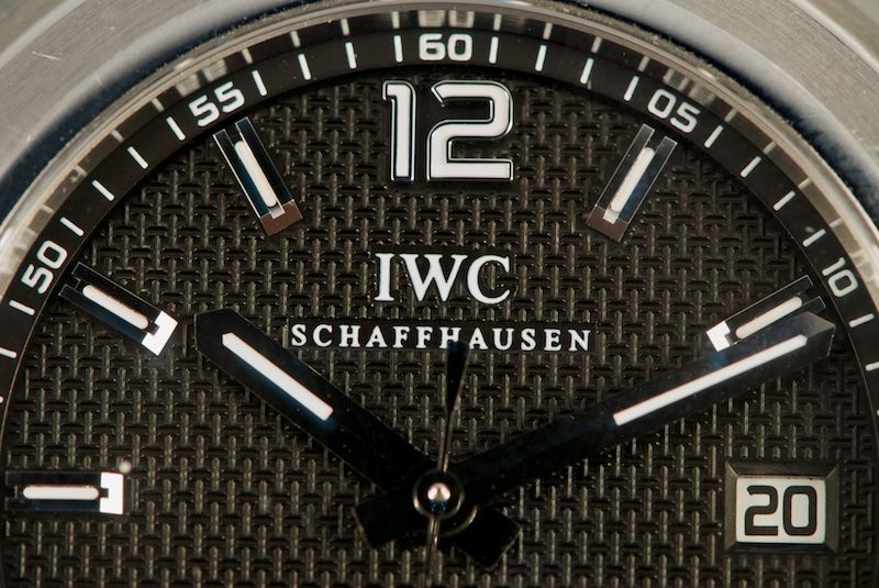
In the second column is reference #3201 St. Antoine de Exupery Power Reserve from 2007 and the reference #3227 Ingenieur from ~2005. The logos for these two are the common one on most IWC’s of the current collections. It is also used on the Portuguese Automatic and Portofino VC.
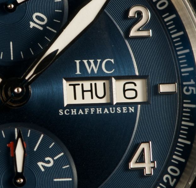
In the third column is reference # 3717 Laureus Spitfire from 2007 and reference #3711 Der Doppel Chronograph from ~1993-94. For these two, the variation is the placement of the logo over and under the day – date window at 3 o’clock vs. a location at 12 o’clock. But note the 3711 has both the IWC and Schaffhausen above the window while the Laureus has it split above and below the window. This is a minor design variation, but it is interesting to see how a designer feels his creation should be different.
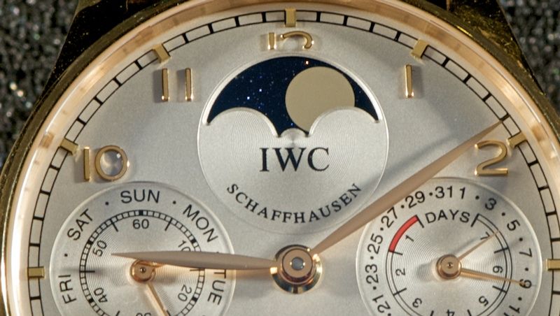
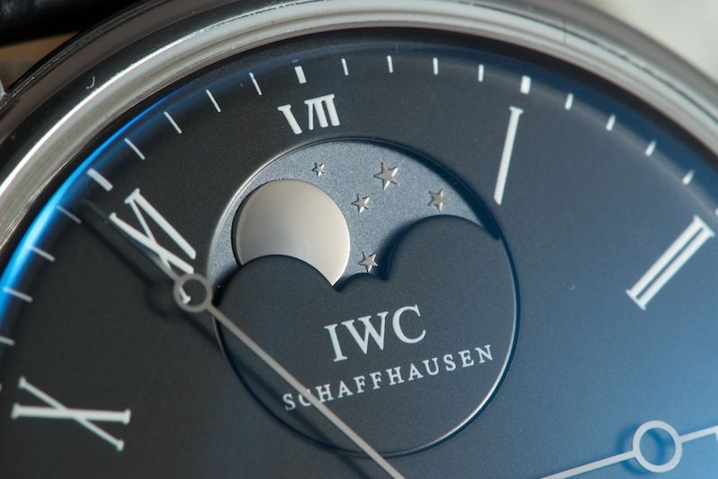
The fourth column are my two moon phase IWC’s. First is the beautiful and very special reference #5022 Portuguese Perpetual Calendar. Secondly, we see the reference #5448 Portofino Vintage Collection. The PPC has a minor design difference from the VC. The PPC’s Schaffhausen is curved to follow the sub-dial opening, while in the VC Schaffhausen is a straight line under IWC in its sub-dial. The PPC is from ~2006 and the VC Portofino is from 2008.
In the last column is reference # 5001 Portuguese Automatic from 2004 and a reference # 3702 Porsche Design Titan Chronograph from ~ 1987. The PD is unique in not utilizing Schaffhausen in the logo.
I hope to see your posts of different designs.
Cheers,
Bill
 ](
]( ](
]( ](
]( ](
]( ](
]( ](
]( ](
]( ](
]( ](
]( ](
](


