Hey guys,
I will be in & out of town, might miss the post like I missed the magazine.
I am in fellas.
Book mine.
Cheers.
MK
Forum Watch 3?
- 213 replies
- last reply by manishkuki 28 Feb 2012
-
 Connoisseur
 -
 Apprentice
First post but a long time lurker. Pls count me in!
I love Collectors Forum Fliegeruhr (CFF) but my suggestion is to simplify it to Forum Fliegeruhr (FF).
That way the central "f"s in Schaffhausen can be highlighted in constrasting red colour - being subtle and balanced - like most classic IWCs.
Happy to provide a deposit. Just tell me how.
Tai
-
 Connoisseur
This is a fatastic development and a grand gesture from IWC to make this happen for the third time, if possible obviously. Really supperb and even worth a premium...;-)
-
 Master
most of you may think this is silly, but i think something on the strap relatively identifiable from afar would be a neat addition. and inexpensive to implement, like say a different coloured perpendicular strip of colour across the leather band. i liken it to the subtly thin and rectangular red tags of prada items which are instantly recognisable.
think of it - we'd all be able to tell within 15 feet away that you're a devoted fan / collector's forum member (and have reason to say hello and chat all things IWC). it's also a unique and more obvious way of 'uniting' all the CF watches going forward (other than just the engraving on the back of the previous ones). just a thought (and no i will not be suggesting secret forum members hand shakes next!). vinhthang
-
Master
I agree that visibility should be a serious issue, visibility through the strap is a nice point not mentioned before: thank you! It could go with an equally recognisable colour of the dial: that one is the first to consider as a dial is about permanent while a strap can be changed, and maybe a bracelet is offered, like at the last two occasions. A Mark XVII with a red dial, and a black strap with red stitching, why not? (just kidding!)
Kind regards,
Paul -
 Master
World timer,
Red hands and CF on dial. Folding clasp and
Resonable price ....
My wife is going to kill me.Exciting were MF will get us.
Cheers
Bas dekkers -
 Master
The more comments... the more my thoughts change.
Here's where I am right now.
MARK XVII
Blue Dial
No Date
CF3 (Red)
Automatic (Black)Bracelet (Mico-Adjustment if possible)
Blue Alligator Strap (Included)
Where do I send my deposit?
Andy
-
Master
unfortunately as mentioned by other members i think a blue dial is a long-shot given that's reserved for the LAUREUS sports foundation limited edition watches. and yes, even though there are lots of shades of blue. as per my previous post, i think a consistent colour for every forum watch going forward would be a great way to bring some continuity and instant recognisability.
maybe there should be another sub-topic "what PERMANENT dial colour would you choose for all forum limited edition watches going forward?"
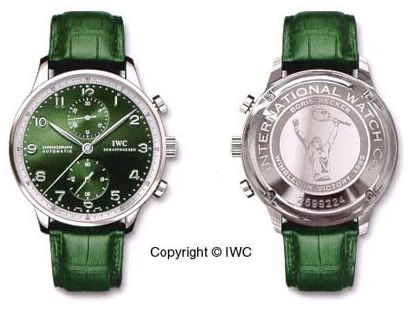
as long as it's not this type of kermit green please...! vinhthang
-
 Master
Take the ugliest color, put the in-house calibre, keep dimensions still, I'll buy it anyway.
-
Master
I think this is a great idea, that, alas, probably cannot be executed for the first and second watch anymore: those colours were grey and silver. But why not fantasise about a colour that might suit us, at least for one watch? Two aspects are important: the total result must be tasteful, and it must be recognisable. The Laureus series fulfils these requirements.
I agree that the Wimbledon green example is a bit undefensible, green being a very harsh colour. But a very light and soft almost greyish green in a metallic sunburst style could be done, I am sure. The colour I would like to see is either a light copper coloured dial in a metallic sunburst style, or a light greyish pink in a metallic sunburst style. The latter colour without sunburst once was used for a limited edition Ingenieur Automatic for Japan, it looked great in my opinion. But I wouldn't be surprised if plain grey without sunburst is the colour chosen, like on the CFI, leading to no controversies. Would look good enough on a Mark XVII...
Kind regards,
Paul -
Master
Paul, Agree very much with your views.
Namely as you mention: Light Copper, Greyish Green, Greyish Pink. I wouldn't mind seeing a warm Brownish Yellow (almost sand), but that might not be recognisable enough given the limited edition Antoine de Saint-Exupéry ones with such a dial already out there.
Vinhthang
-
Apprentice
As a Big fan of the pilot family, the concept of a CFF/CFP sounds tremendous. In catching up on this fast-moving thread I've also been surprised that quite a high degree of consensus has emerged given the wealth of tasty options available!
For all the reasons mentioned, my vote (and hard earned) would be a Mark XVII with some subtle personalisation / colour scheme for the dial and case engraving. in terms of precise design, I would be happy to see if Schaffhausen might take a lead as we know they have an eye for gorgeous timepieces!
My line of work often requires lateral ideas, so hopefully it isn't sacrilegious to think of placing C-F-F where the 7-6-5 numerals on the dial would be (I know there's no 6 to replace technically). In the same font and type size this would be quite subtle to the casual observer but clearly stand-out when finally noticed. Just throwing it out there.
Look forward to white smoke... And thanks to MF for taking up the mantle.
JP
-
 Connoisseur
Big pilot stainless steel. Dial variation.
-
Master
I've come around to the appropriatness of the Pilot Family (CFP) and my vote would go to a Mark XII based version.
-
Master
But when does the year of the Portofino end and the year of the Pilot officially start?
Was it 16th January 2012, or will it be June 2012, when I assume the new 2012/2013 catalogues will be released. Perhaps the Portofino could still be in the running? -
 Insider
I say a vintage Portuguese with a vintage dial similar to one of the originals. Some of those early dials were stunning. Cost should be kept down because the case and movement are already there....Just add the unique dial and a solid case back and.....There you go!
-
Insider
If a Mark then how about a new Mark done with a dial to resemble the Mark X.
You could use the case from the new Mark and fit a suitable movement with sub seconds at 6. -
Insider
This post is hidden. You cannot not see its contents.
Hidden by on 8 Nov 2018, 4:22 p.m..