IMHO sunburst blue dial on the Yacht club:
Do you agree?
Thanks for posting :-)
IMHO sunburst blue dial on the Yacht club:
Do you agree?
Thanks for posting :-)
I would have agreed till they launched the BPLP.
Kevin
BPLP? Sorry?

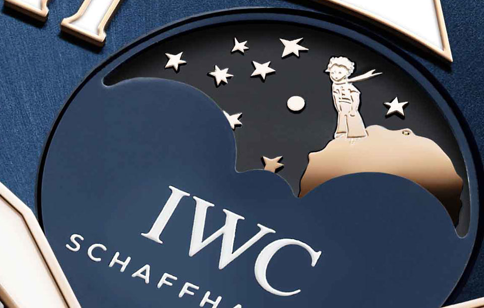
Big Pilot Le Petit Prince.
Thanks Bill.
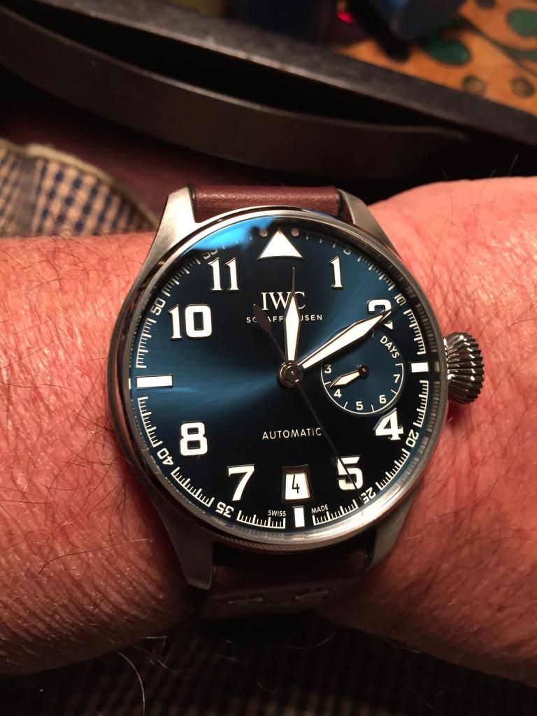
I really hate white date disk on blue dial!
[ ](s1127.photobucket.com/user/Mooseman2/media/IMG_4196_2_zps5ebbb7d5.jpg.html)
No white sub dials on this beauty.
Kevin

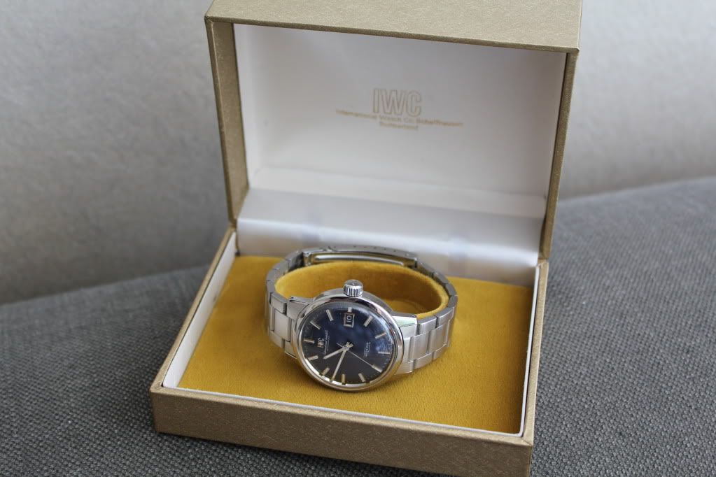
Blue sunburst on an 866.
This

But I think the new IWC PPC WG/Blue Portugieser has a very good chance of outdoing this.
It's one of these. Probably the BPP.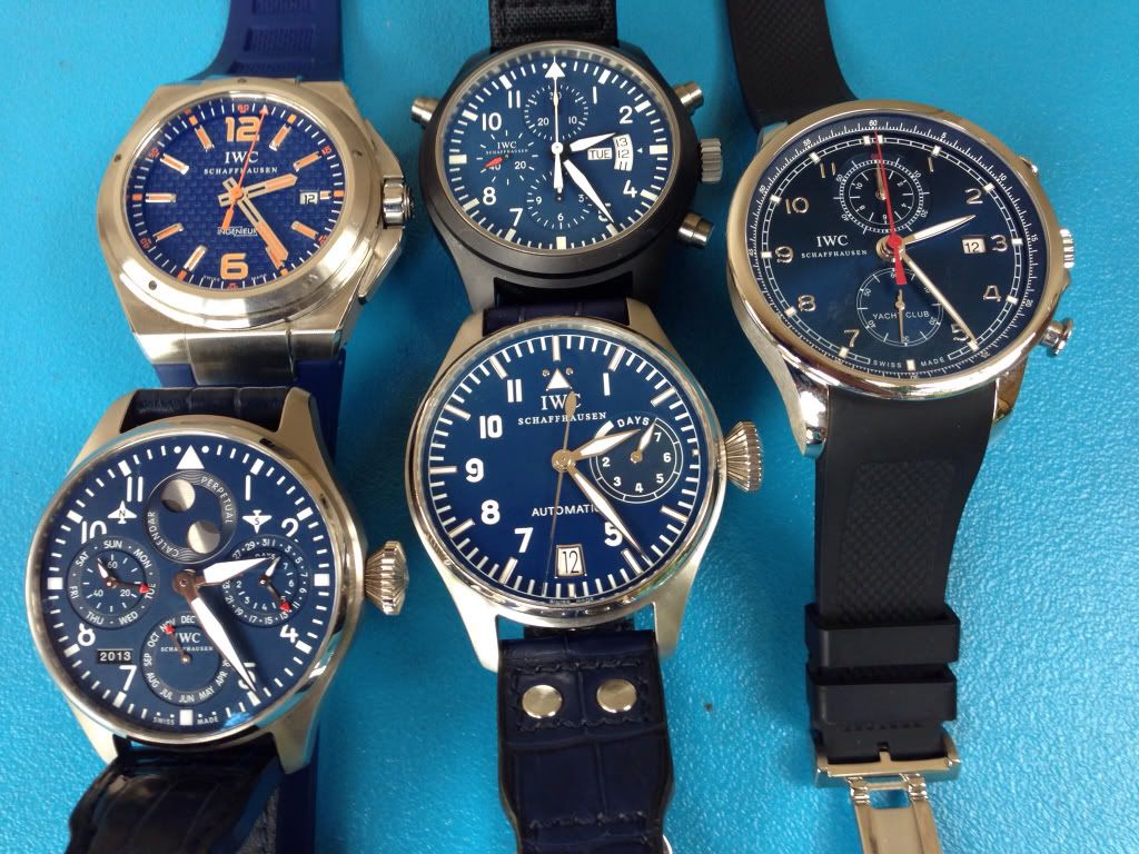
It's the LPP BP for me.
Cheers,
Jarrod
It is the Big Pilot edition Le Petite Prince for me also; that large dial really shows off the blue sunburst and with the beautiful white applique font it is really tough to beat. Kevin - Stefano is referring to the white date wheel underneath the dial. I am not really bothered by the white color as the 12, 3 and 9 are missing and replaced with white markers so it appears as a balanced design to me. Stefano would prefer it to match the dial color. I would, however, have preferred that a matching font was used as the font was matched on the seconds index ring and the power reserve sub-dial quite nicely. Another standout, to me, is the Big Pilot Perpetual edition Le Petite Prince - that blue dial with that font combined with the red gold? Absolutely stunning!!! And the single moon display is much cleaner/ less cluttered than the double moon BP perpetuals, IMO. And then the Little Prince standing on that (asteroid) moon is an amazing touch! I'm still kicking myself for not bringing home the one I tried on in the Taipei boutique!
A couple shots I "borrowed" off the web: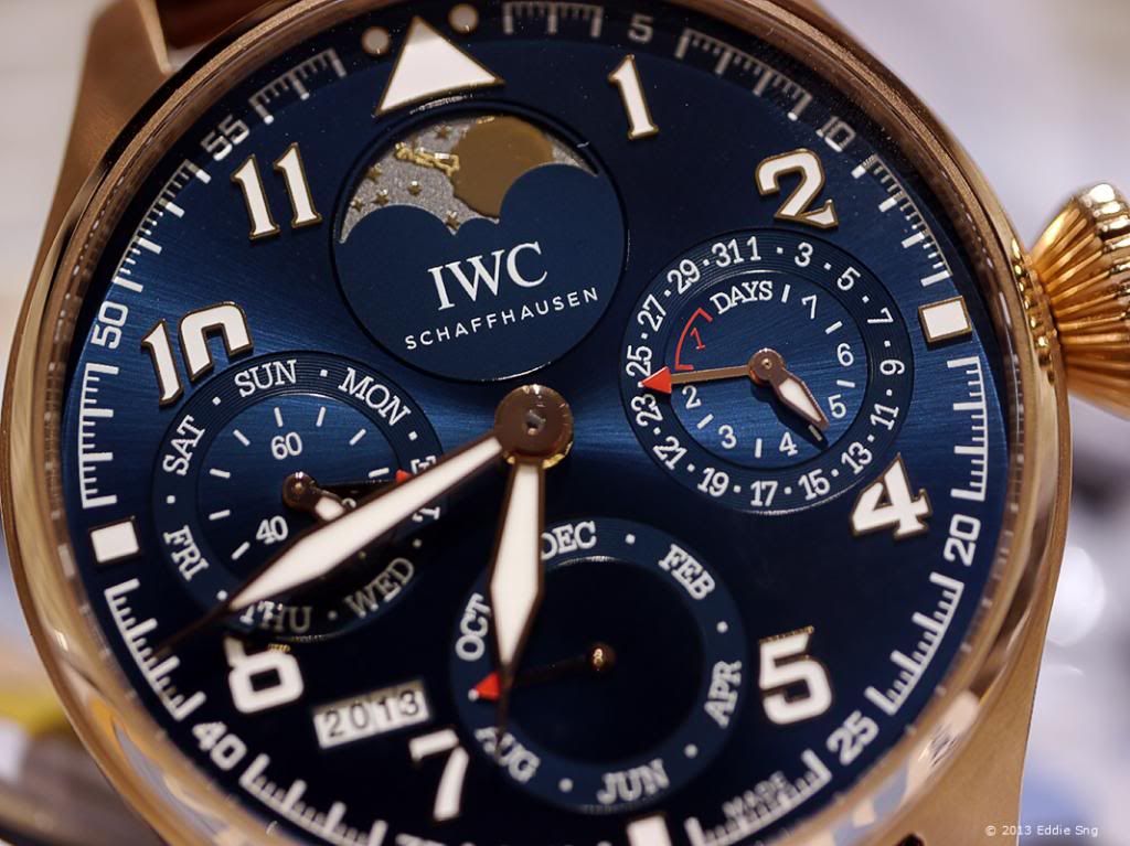
maybe the blue dial of an oldie ?
BP LPP for me!
Cheers Chris

Right you are.

If I had had the funds it would have been this watch. You're right, Ben: The little prince standing on his little planet which is the moon here, is just amazing.
But I'd be really happy if it would be this one this year which comes close:
I prefer the cold-blue dial of the Laureus watches to the darker navy-blue ones, though I have only a fraction of blue dial - 2 blue subdials of the 376706 love that too...
Laureus blue, especially in the VC Ingenieur or the pilot Chrono and so I am told the Portuguese YC. The blue sunburst on Rave's 866 is still a masterpiece though.
+1
/Anders