• Connoisseur
    28 Jul 2010, 4:50 a.m.

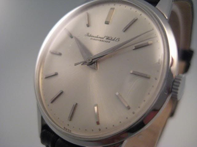
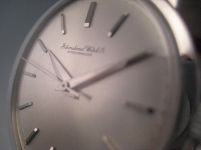
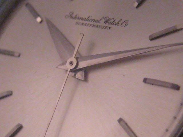
    Gentlemen, I just want your thoughts on this , when did IWC stop writing the IWC in full ( International watch Co.) on the dial of the watches and just put the acronym.
    I think the full writing looks much better on the dial of the watch I have never seen a watch more beautiful then a picture in one of the IWC catalogue of a minute repeater in white gold with a black strap and the full IWC written on it, if I could afford to buy that watch one day I will have to hunt for one with the full writing on the dial.

    I was just wondering why and when did they stop this? do you prefer the dial having only IWC or would you have preferred the full International Watch Co written on the dial? maybe it just does not bother you? Have a look at the Portuguese Pisa in one of the pictures on a post below, how nice it looks. I prefer the full writing instead of the acronym.

    Farhad

  • Master
    27 Jul 2010, 1:20 p.m.

    Space

    I guess iWC wants to show its brand name in a consistent way on all its watches. Using the full name is a huge problem on a Portuguese Perpetual Calendar. If only the full name would be shorter, like nine letters. But it is not. And everybody says IWC, not International Watch Company. Like most people probably say USA instead of United States of America. I like the modern typeset of IWC, and I am totally happy seeing IWC on my watches. As all of them also show Schaffhausen, the total picture looks very balanced.

    Kind regards,
    Paul, wearing rose gold VC Portuguese, showing IWC Schaffhausen

  • Master
    27 Jul 2010, 10:40 p.m.

    I prefer the script International Watch Co on

    dressy watches, which I think is a far more graceful treatment. However, I must admit the shorter version looks pretty good on my chunky and sporty Aquatimer.

    www.fototime.com/%7B4A9D1FB5-A615-45F2-B735-184F32AB407F%7D/origpict/DSCN6240.JPG

    www.fototime.com/%7B9F0DF1D6-B750-462B-86AF-B452A7FF65DD%7D/origpict/IWC%20Aquatimer%202000%20008.jpg

  • Master
    28 Jul 2010, 1:25 a.m.

    Paul, I think there is plenty of room...

    just depends on the font size and skill in placement.
    --
    Cheers from Isobars.

  • Master
    28 Jul 2010, 3:05 a.m.

    2005 and 2008

    According to the catalogues, the Portuguese Minute Repeater 5240 was the last wrist watch with International Watch Co. on the dial, in 2005, as were the last pocket watches in 2008.

    Kind regards,
    Paul, wearing rose gold VC Portuguese

  • Master
    28 Jul 2010, 5:40 p.m.

    As beautiful as it is, it lacks power

    Most IWC watches have quite a powerful impact, certainly in recent times. The long name on the watches shown are not in line with this, I guess in these days it sends the wrong message. I like the powerful IWC on all the watches, and prefer it to the long name, with the exception of the Portuguese Minute Repeater. But I understand the one logo strategy, and can certainly live with the new Minute Repeater, also because of the chances of me owning one are very dim.

    Kind regards,
    Paul, wearing steel VC Portuguese, where IWC looks just fine

  • Master
    29 Jul 2010, 6:55 p.m.

    Rebranding

    Rebranding from International Watch Company to IWC may or may not work as a marketing tool. But when all is said and done there are watches where the full beautiful script says so much more than IWC, even though the script itself is so much bolder. I agree that the PPC run out of space for the full script and possibly the Chronos as well but when you see those 3 watches all together the IWC does not add to the watch in any way IMO.